Cloudcore
About
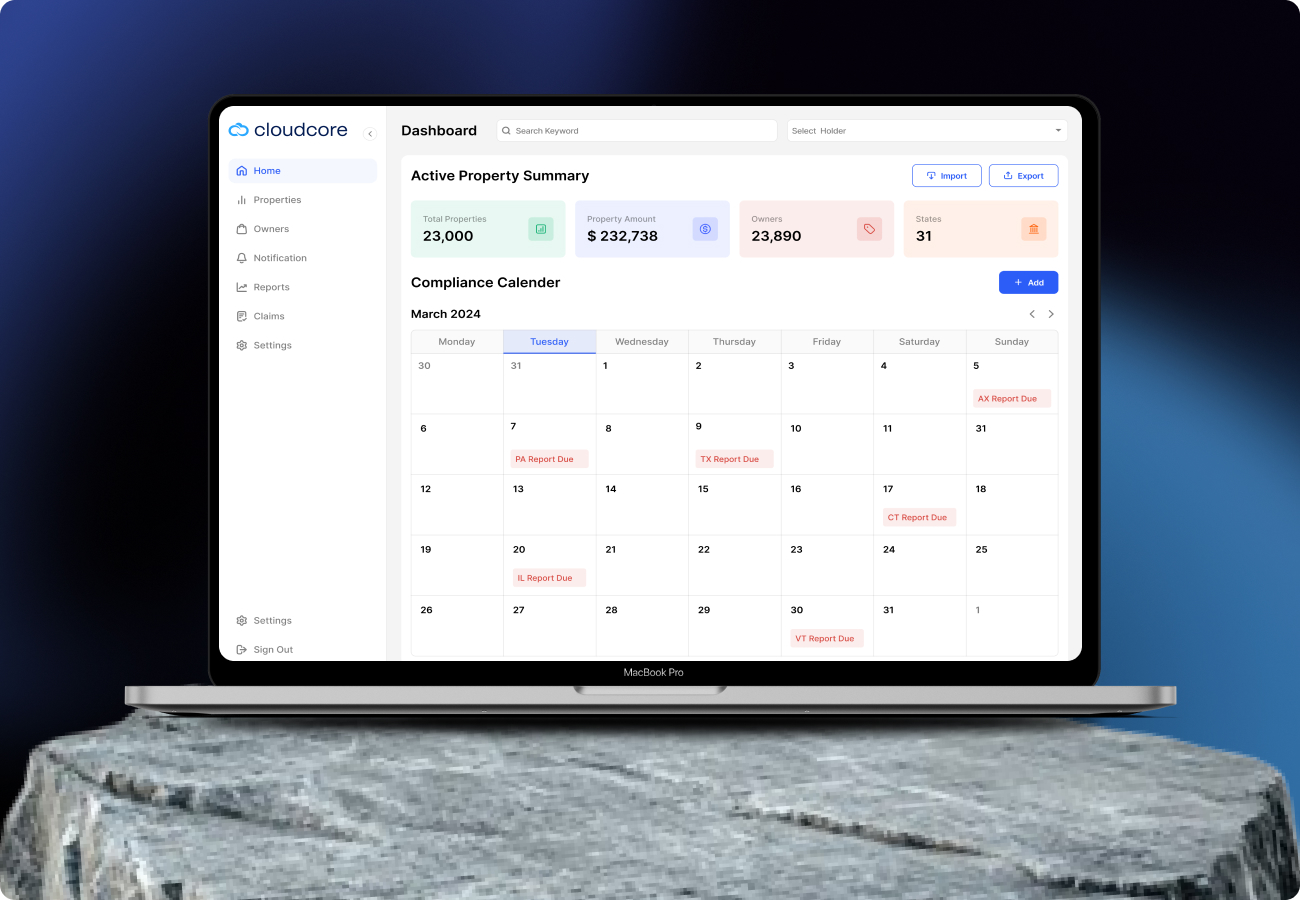
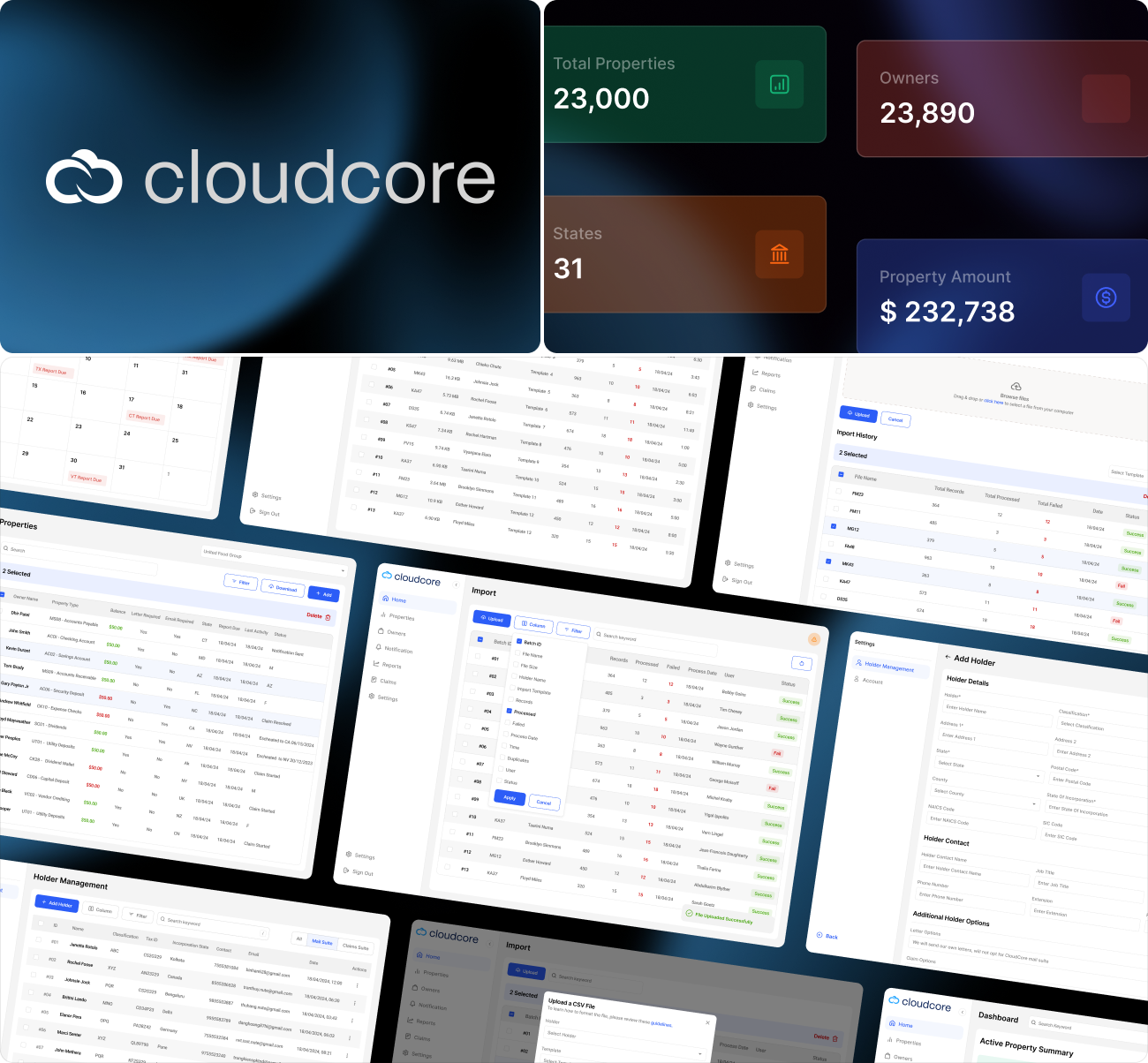
This platform replaces spreadsheet - based tracking and brings all property financial accounts into one system. Every balance, required letter, and document is mapped clearly to the respective owner record. Teams get instant visibility into deposits, claims, validations, and proof files - all from a single screen.
It is designed for enterprises that manage multiple properties where funds need continuous monitoring. The system reduces manual searching, avoids data duplication, and converts scattered information into structured insights. Overall, it turns property fund management into an audit - ready, fast, and transparent workflow.
Problem
Property financial data stays scattered between email, spreadsheets, and legacy accounts. Teams waste time switching tools and searching for letters, receipts, and documents. Compliance validation becomes slow, repetitive, and inaccurate.
Solution
A single unified platform where every account, document, owner, and claim activity is accessible in one screen. Smart filtering, letter flags, documents timeline, and bulk actions reduce admin work dramatically.
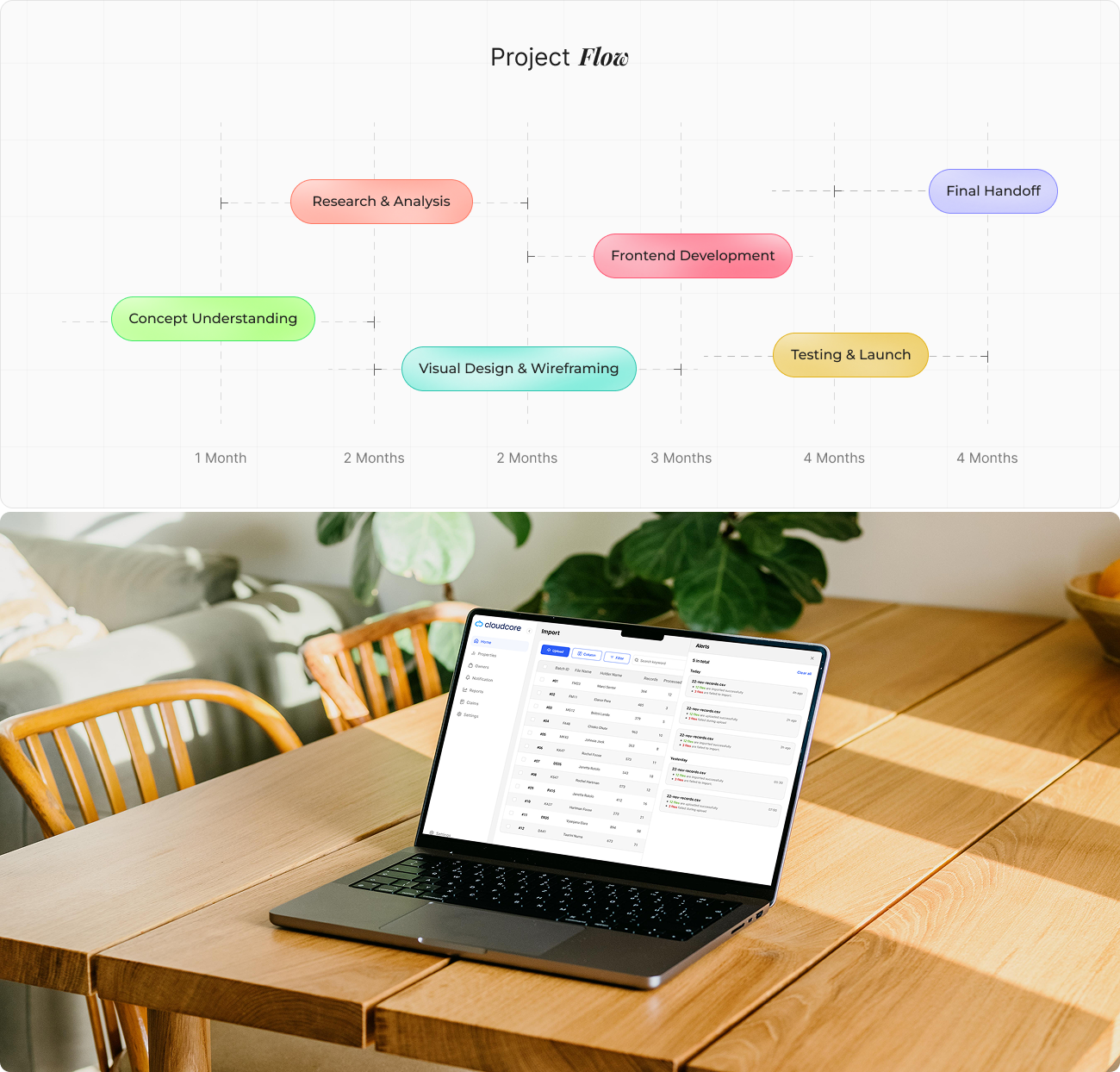
From Concept to
Wireframes were structured around a table - first approach because a grid layout best supports high volume account data. A right - side detail panel was selected so users could inspect one item without losing their current table position. This reduced navigation friction and increased productivity.
User
To understand user needs, we conducted research with we reviewed how finance teams currently track property deposits & documents. Insights showed they needed visibility, faster approvals, and proof attached workflows.
We transformed these insights into design opportunities - focusing on clarity, speed, and user control.
User Interface
The UI emphasizes clarity and function over decoration - every visual contains meaning, and every component has purpose. The design feels enterprise grade and logical, similar to professional accounting tools, but it stays modern in behaviour and interaction flow.
The backend logic handles dynamic analytics computation, while the frontend delivers fast rendering dashboards through optimized state management. This ensures users experience responsive navigation and uninterrupted insights across all devices.
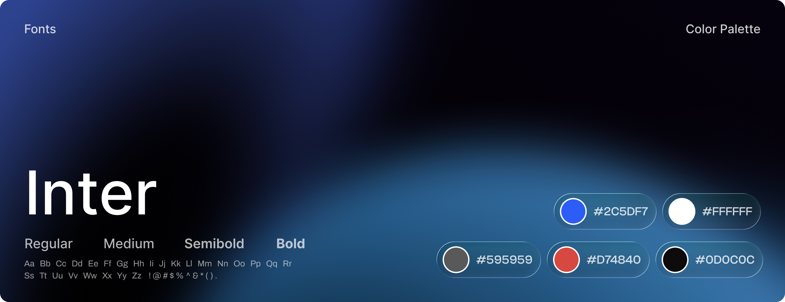
Style
Cloudcore visual system embraces minimal clarity and structured spacing. Interfaces are tuned to feel light yet professional, allowing complex cloud data to stay readable without visual noise.
Soft neutral tones and refined typography pair with subtle accent emphasis, bringing warmth while still keeping the overall tone analytical and focused.
Software