BastionGPT - AI Assistant
About
BastionGPT is an AI powered platform designed specifically for healthcare professionals to simplify the process of managing patient records and creating personalized treatment plans. The goal was to create an intelligent and intuitive system that could support doctors in their daily decision-making while reducing the administrative burden that often comes with patient care.
The platform combines conversational AI with a clean, medical-grade interface, allowing doctors to interact naturally while retrieving or entering patient data through prompts. It also analyzes medical histories to suggest potential treatments or diet plans based on patient conditions.
Problem
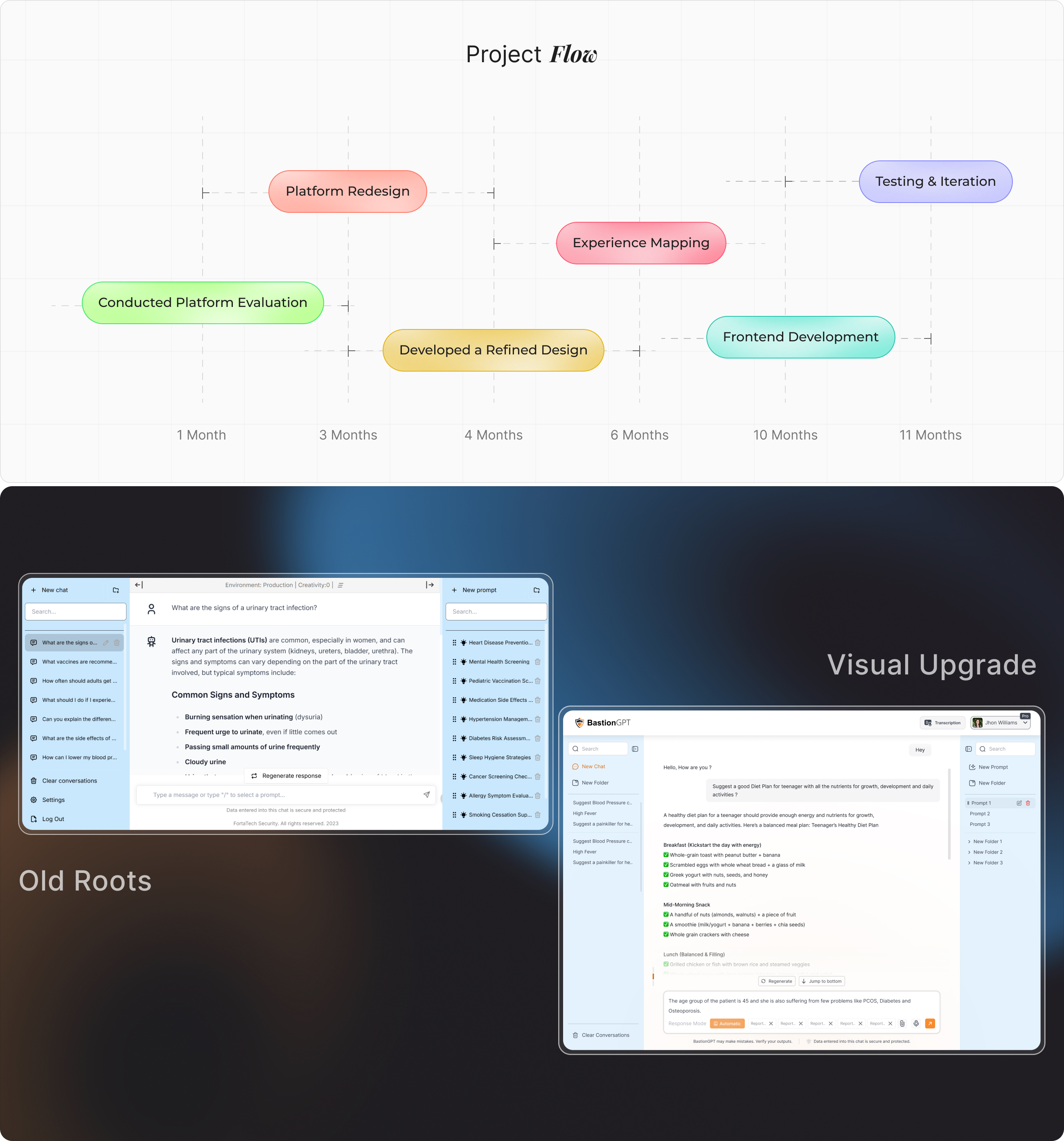
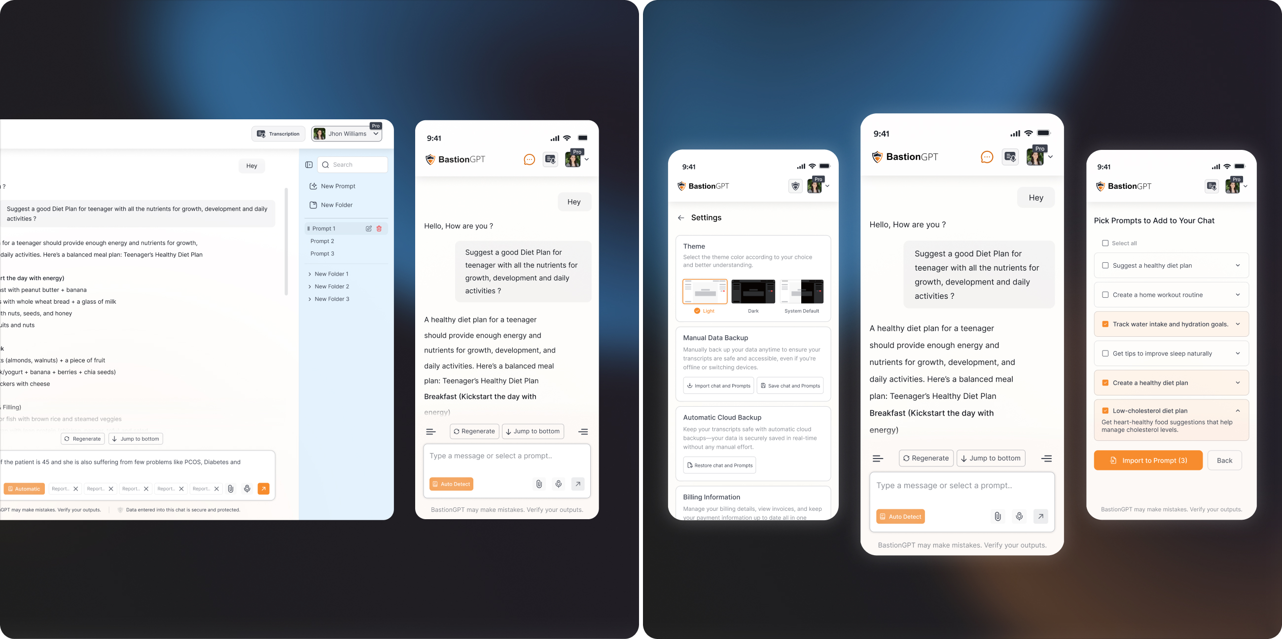
The main problem the client faced was that users were not using the response mode button effectively and often got confused with the folder and prompt creation process. The interface was complicated and lacked essential functionalities, making it difficult for users to navigate.
Solution
After understanding the client’s and users requirements, we redesigned an intuitive platform that allows users or doctors to manage patient data through prompts, folders, and response mode functionalities, significantly improving the overall efficiency of the process.
From Concept to
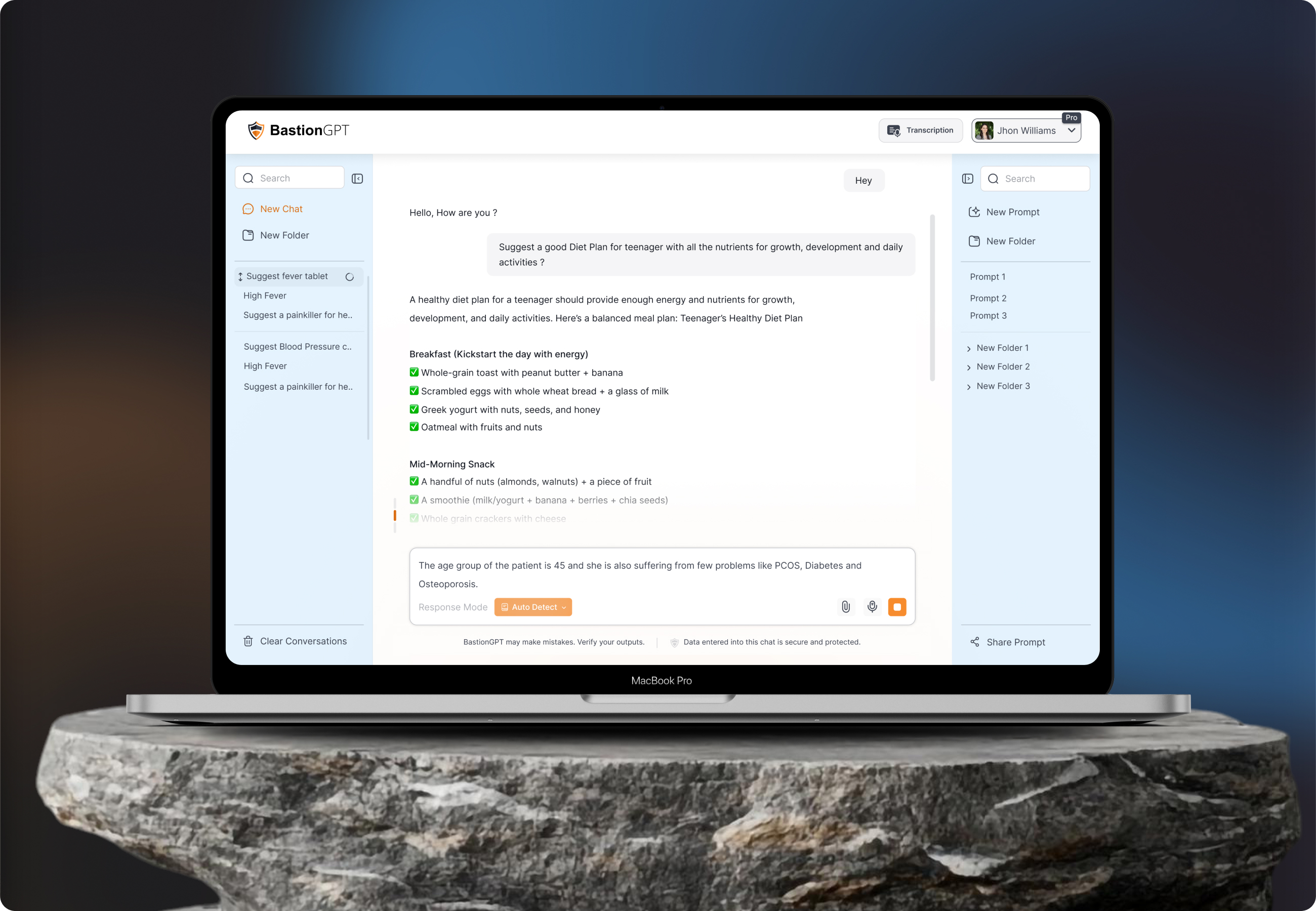
The redesigned version of BastionGPT prioritized efficiency, calmness and look and feel. The interface included a simplified sidebar for navigation, allowing doctors to easily start a new chat, create folders for patients, and categorize health topics such as “High Fever,” “Blood Pressure,” or “PCOS.”
The AI chat window was restructured to show both doctor queries and AI generated suggestions clearly, using color contrast and clean spacing. Each response was visually grouped and designed for readability, ensuring that medical information was easy to interpret at a glance.
The result was a professional, minimal, and intuitive environment where doctors could focus solely on patient care, without distractions from unnecessary visual clutter.
User
User research centered on understanding how AI users interact with multiple large language models and the frustrations they encounter when switching between tools to find the most effective responses.
Many users expressed that managing subscriptions to several separate AI services is time consuming, costly, and confusing, often leading them to compromise between speed, accuracy, and cost. Research insights revealed a strong need for a unified interface where advanced AI capabilities could be accessed in one place, with straightforward navigation and minimal cognitive load.
User Interface
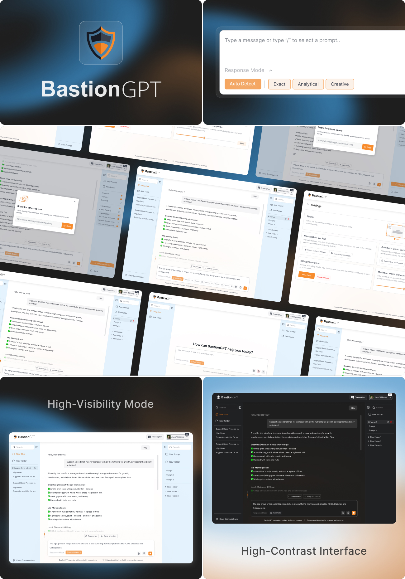
BastionGPT was designed with a focus on creating a seamless and intuitive experience that reflects the precision and professionalism of the healthcare environment. The goal was to combine a modern, minimal UI design with a calm, clinical aesthetic that builds trust and reduces visual clutter.
Every design decision - from spacing and component placement to iconography and color accents - was guided by the need for clarity and usability. The overall aesthetic maintains a clinical tone while ensuring the interface feels approachable and human. Thoughtful attention was given to accessibility and consistency, ensuring that doctors could navigate and manage patient data effortlessly, even during high-pressure situations. The result is an interface that emphasizes simplicity, precision, and efficiency, allowing users to focus on what matters most: patient care.
Style
The visual identity of BastionGPT was crafted to embody trust, clarity, and professionalism, aligning with the precision and empathy expected in the healthcare domain. Every design element was intentionally chosen to create a calm, reliable, and user - focused experience for medical professionals.
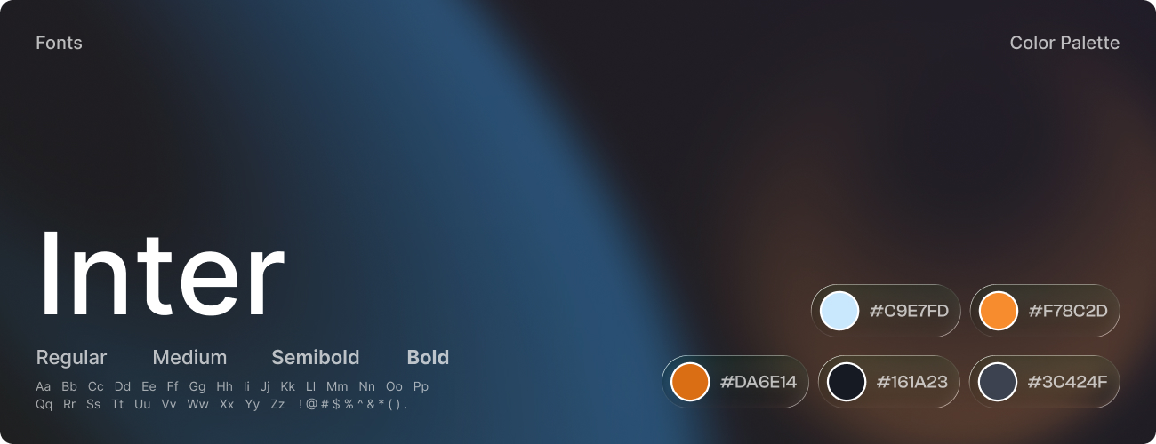
The color palette featured soft blues and whites to convey cleanliness and confidence, supported by light grays for structure and readability. Subtle orange accents were used strategically to highlight key actions and guide user attention without visual strain. The typography system utilized the Inter typeface for its modern clarity and cross-device accessibility - bold weights emphasized hierarchy, while regular weights maintained smooth readability across data - heavy screens.
Software