KnowDesk
About
KnowDesk is a micro - learning platform that delivers short, crisp daily knowledge to users. Every day users receive 10 knowledge snippets focused on a single topic so learning feels light, fast and not overwhelming.
The goal of KnowDesk is to help users build continuous learning habits in a simple way. Instead of long content or long courses, KnowDesk gives only the extracted “core knowledge” in minimal format - so users can upgrade themselves daily in small steps.
Problem
Most people want to learn, but don’t have time for big books or full courses. People get distracted, lose consistency and end up consuming random content on social media instead of real knowledge.
Solution
KnowDesk compresses complex knowledge into structured micro - chunks. Users get quick clarity in minutes, not hours. It becomes easy to learn daily, because the content is small, direct and straight to the point.
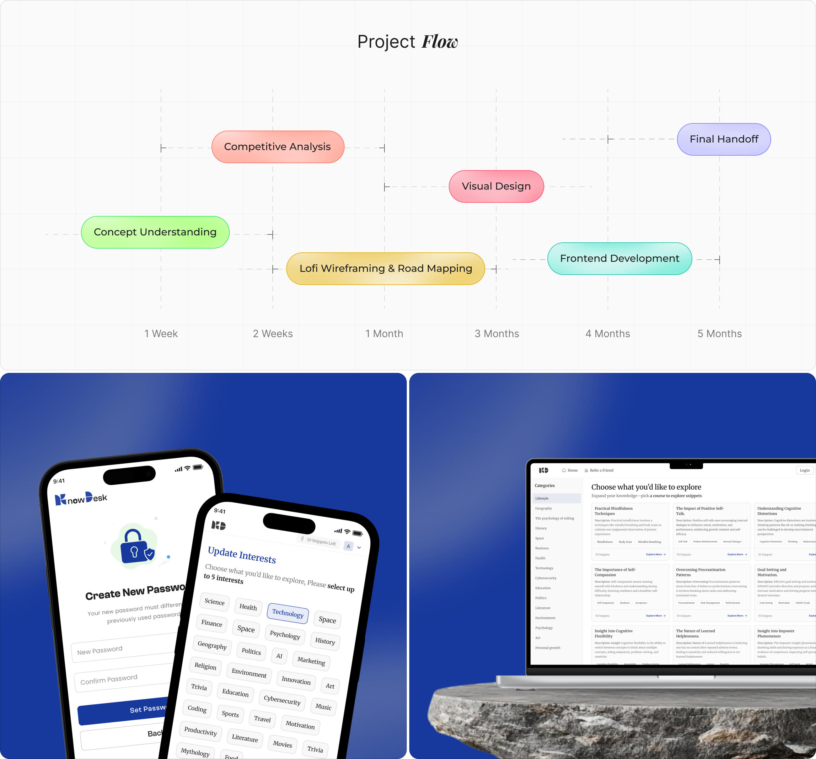
From Concept to
The blueprint stage focused on organizing how knowledge flows from categories to snippets. We created information hierarchies showing how users navigate between Knowledge, Books, and Courses, ensuring that content delivery remains smooth and accessible. Wireframes helped test how users interact with daily updates, navigation, and saving features before final design implementation.
User
Our research focused on understanding how users consume information online. Surveys and interviews revealed that most users prefer short, high value content they can read quickly during breaks or daily routines. We found a strong desire for an app that delivers consistent micro-learning without lengthy reading sessions or overwhelming content.
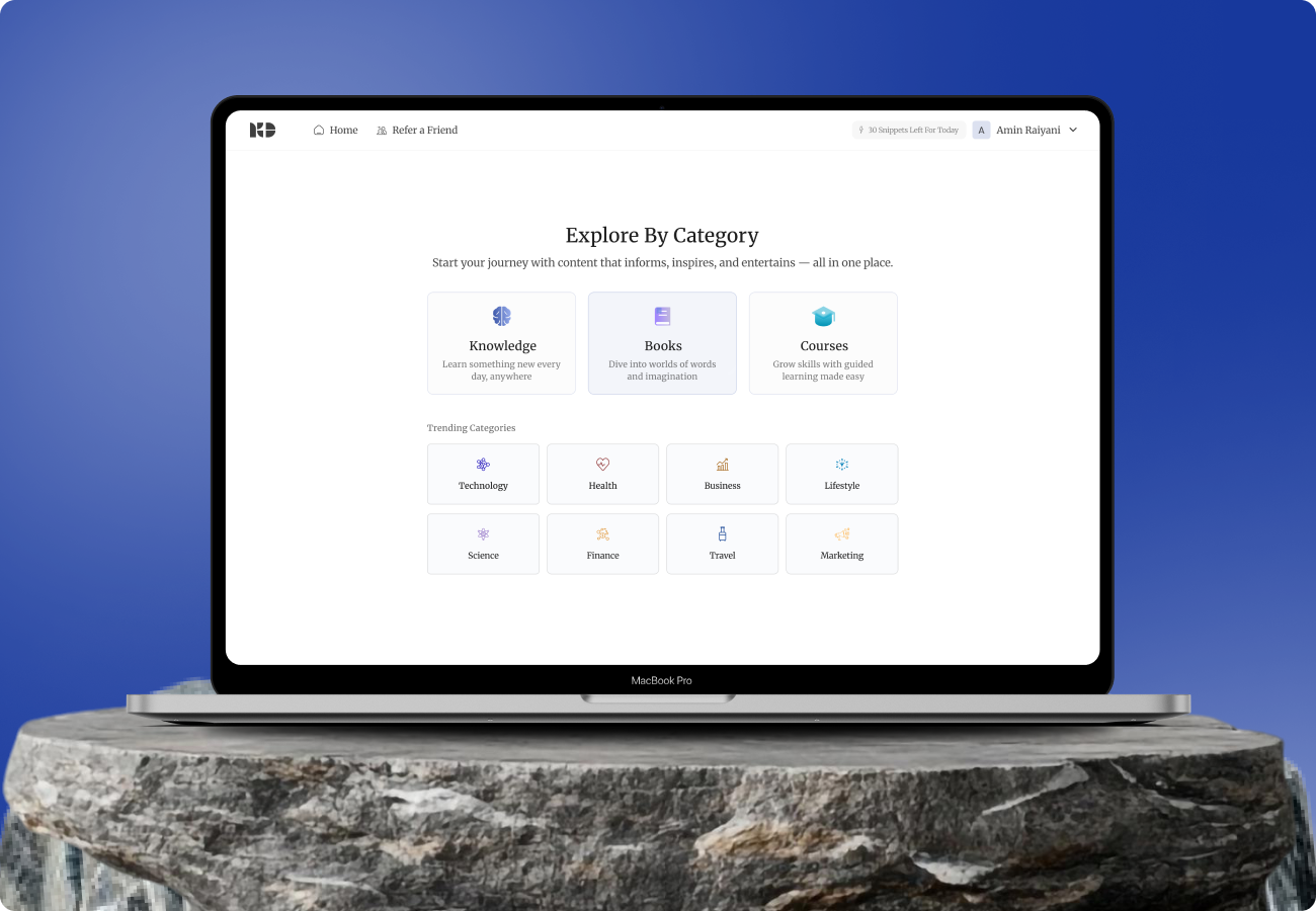
User Interface
The interface was designed with simplicity and clarity in mind. The layout includes a daily snippet dashboard, category tabs, and a progress tracker to show learning activity.
The clean navigation structure ensures users can effortlessly browse topics, open detailed snippets, and explore suggested content. Each element was positioned to maintain a natural reading flow and reduce cognitive load.

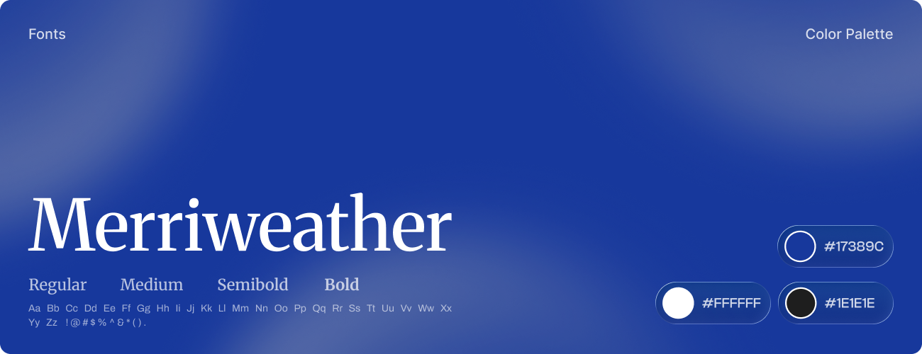
Style
Knowdesk’s visual system embraces minimal clarity and structured readability. The interface was designed to feel light, modern, and knowledge focused ensuring each snippet remains easy to consume without unnecessary distraction.
Soft blue tones and refined typography pair with subtle contrast highlights, maintaining warmth and approachability while keeping the overall tone professional and intellectually engaging.
Software