HourHub
About
This project is a UI/UX redesign of a time and work management platform used by organizations to track employee activity, manage projects, and monitor time utilization.
The platform serves two primary user roles within the same system administrators and employees. Administrators can manage employees, define working schemes, assign projects, monitor time logs, and track project activity, while employees can punch in for the day, log time, associate tasks with projects, and review their own work records. The redesign focuses on improving clarity, efficiency, and scalability across both roles.
Problem
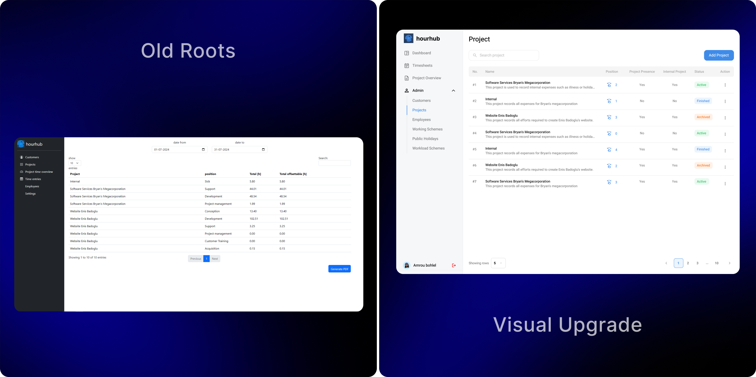
The existing platform had grown functionally complex over time, resulting in a dense interface that made it difficult to quickly understand time usage, project status, and employee activity. Administrators struggled to gain a clear overview of project health, working hours, and utilization patterns, while employees found daily actions such as punch in’s, task linking, and time tracking less intuitive. Visual inconsistency and limited hierarchy further increased cognitive load, especially in data heavy views like tables and dashboards.
Solution
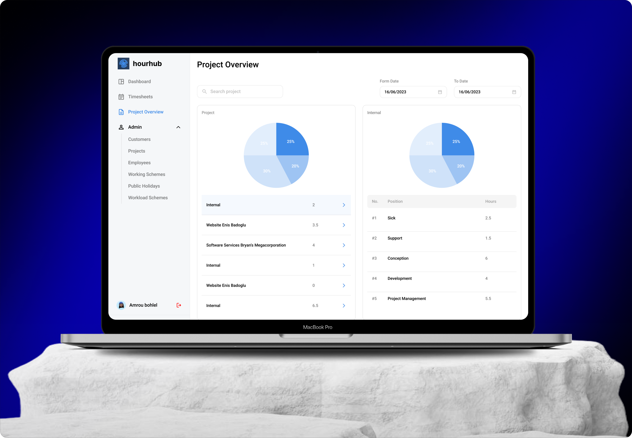
The redesign introduces a cleaner, more structured interface that improves visibility across time tracking, project management, and employee activity. The solution focuses on simplifying workflows, improving data readability, and creating clearer separation between administrative and employee level actions. Visual hierarchy, consistent component usage, and improved contrast were applied to ensure that critical information such as working hours, project status, and utilization metrics can be understood at a glance.
From Concept to
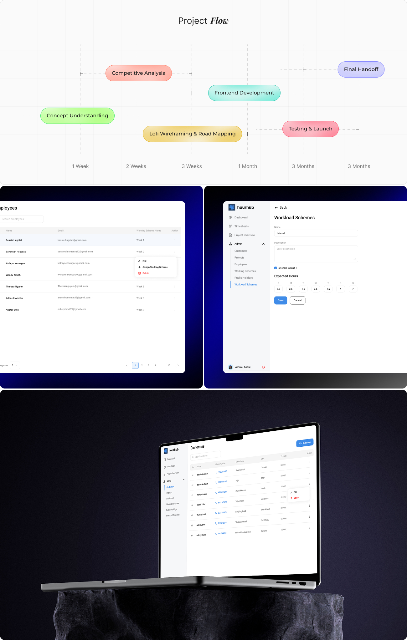
The redesign process began by mapping core workflows for both administrators and employees, identifying repetitive actions and high frequency tasks.
Key screens such as dashboards, project overview, employee listings, workload schemes, and time logs were prioritized for redesign. Low fidelity layouts were used to reorganize content structure and improve information flow before translating them into refined interfaces. Special attention was given to reducing visual clutter while preserving the depth of functionality required by the platform.
User
User research focused on understanding real world usage patterns of time tracking and project management tools. Insights highlighted that administrators need fast access to summaries, trends, and status indicators, while employees require quick, frictionless interactions for daily punch in and task association.
User Interface
The user interface architecture is designed around role based workflows and modular navigation. A persistent sidebar provides access to core sections such as dashboard, timesheets, projects, employees, and workload schemes.
The dashboard acts as the central control point, surfacing key metrics, charts, and summaries. Data heavy views use structured tables with filters, pagination, and inline actions, while form based screens follow consistent layouts to reduce learning effort. This architecture supports scalability while maintaining clarity across complex operations.

Style
The style guide defines a consistent system for typography, color, spacing, and components. A restrained color palette with clear contrast levels supports readability and accessibility, including both high visibility and high contrast interface modes. Typography emphasizes hierarchy and legibility across dense data views. Reusable components such as tables, buttons, form fields, status indicators, and charts are standardized to ensure consistency, reduce design debt, and support future enhancements.

Software