BastionGPT - Transcription
About
The transcription platform is designed to transform how healthcare professionals manage voice - recorded sessions and convert them into organized, actionable text. Built with clinical workflows in mind, the platform enables users to upload or record consultations, automatically transcribe audio, and then sort that content into meaningful notes (SOAP, DAP, summaries, etc.), and manage health records efficiently - all while ensuring a streamlined user experience.
Overall, this platform supports improved documentation accuracy, reduced administrative overhead and enhanced patient - data management for modern healthcare teams.
Problem
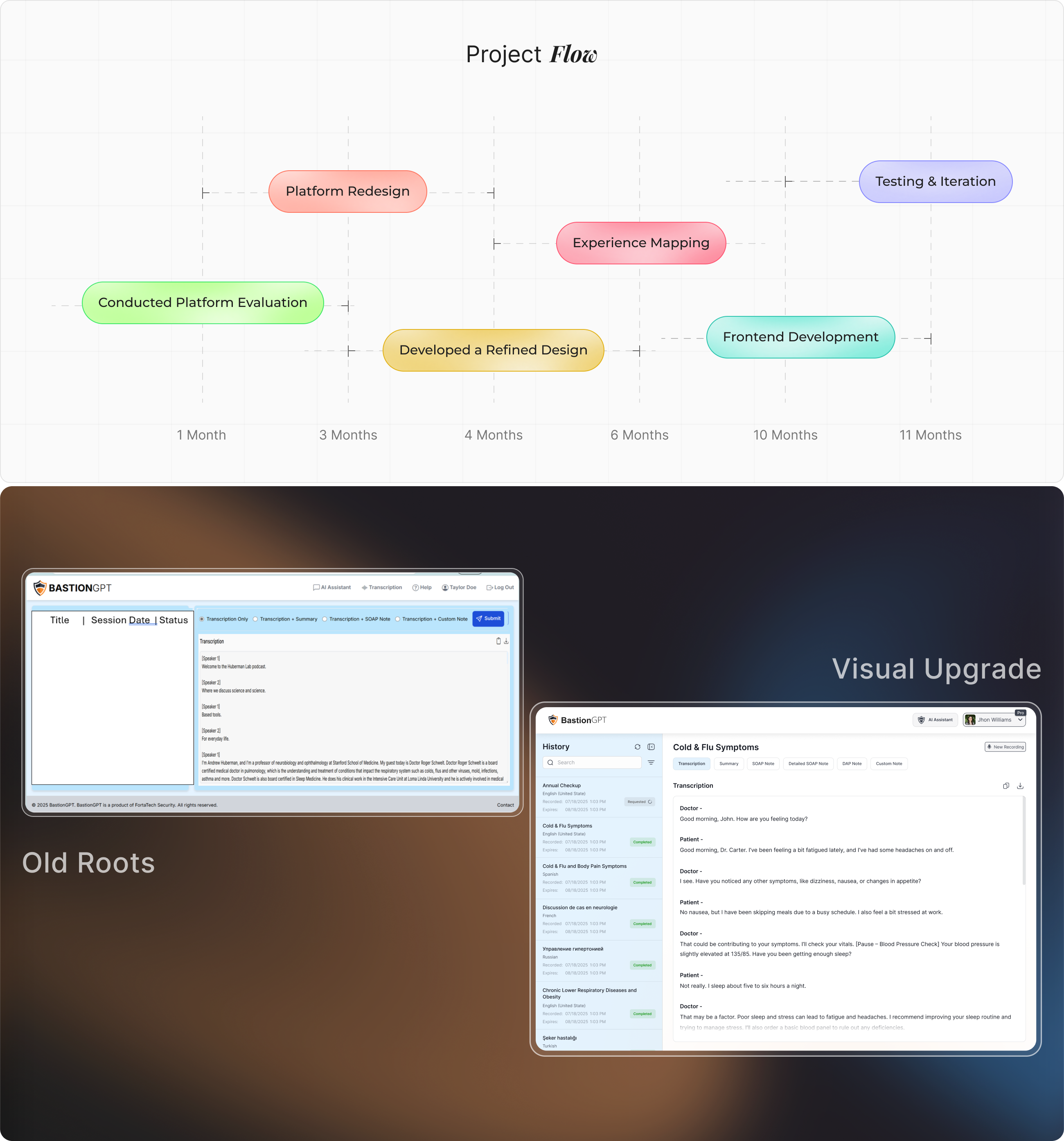
The main problems users were facing included the absence of clear buttons and a cluttered interface. Additionally, there was no easily accessible list to view older notes, making navigation difficult. The buttons for generating different types of notes were also hard to find and not easily accessible.
Solution
After analyzing the previous platform, we completely redesigned the interface to make key actions easily accessible. The buttons were made more prominent, and a visible list for older notes was introduced to improve navigation. The upload and notes sections were also made more intuitive, ensuring users can perform tasks smoothly without confusion or frustration.
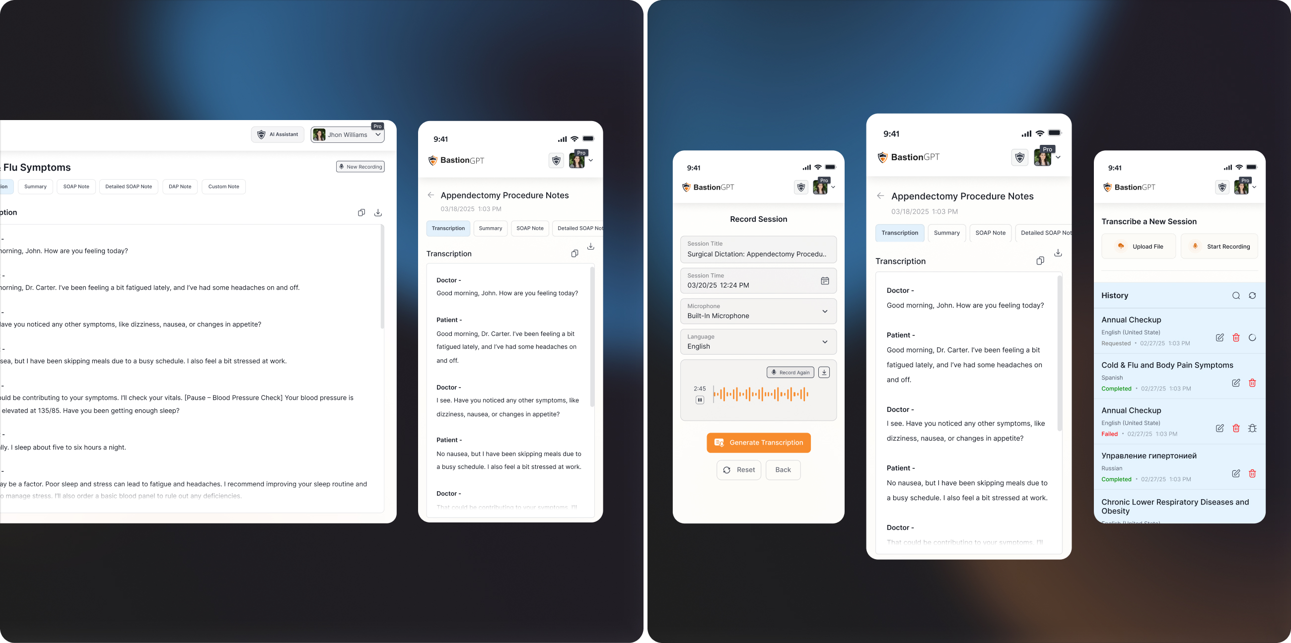
From Concept to
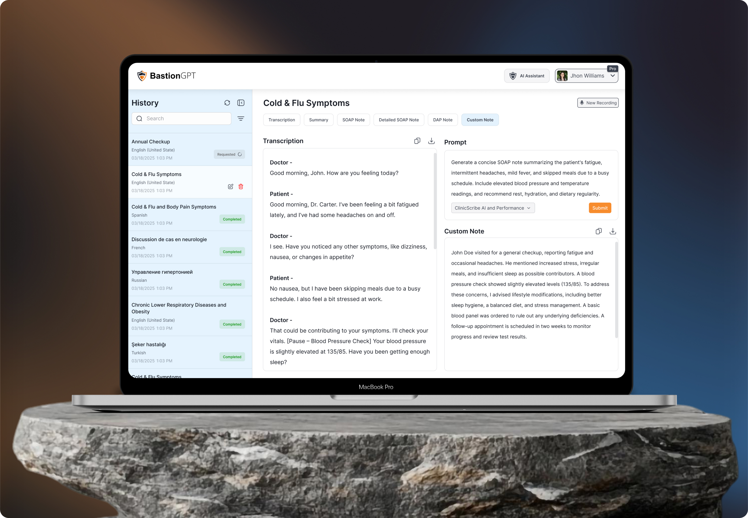
The BastionGPT interface was redesigned from the ground up to align with how doctors actually work. A persistent sidebar was introduced to manage session history, using clear status indicators along with timestamps and language labels for quick scanning. The main consultation panel was restructured to prioritize transcription readability, with a two - speaker format and organized note - type tabs (SOAP, DAP, Summary, Custom). Quick-access actions like "New Recording," vitals check, and download/copy functions were added to streamline the documentation process.
This interface focuses on workflow clarity, reducing the number of clicks required to access or generate information. Each element was positioned to help users move fluidly between listening, generating notes, and managing records - all within one clean workspace. The goal was to give doctors a sense of control without overwhelming them with too many features at once.
User
Focused on understanding how individuals and professionals handle audio to text workflows and the pain points they face with existing transcription tools.
Research showed that users often struggle with inconsistent accuracy, slow turnaround times, and fragmented interfaces that require multiple steps to upload audio, review transcripts, and export results. Many users such as journalists, researchers, and content creators expressed a need for a fast, reliable, and intuitive transcription experience that minimizes manual correction and simplifies access to downloadable text formats.
User Interface
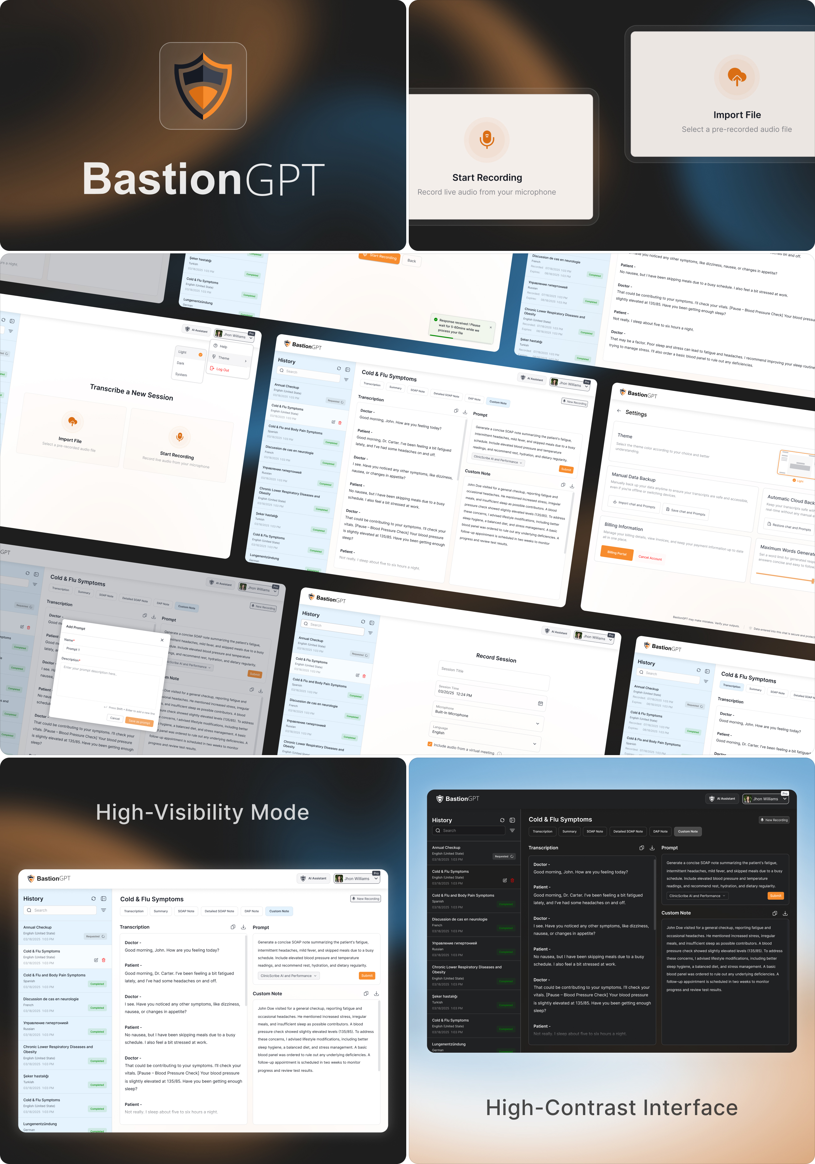
The UI/UX strategy focused on delivering a minimal, medical - grade user experience that supports multitasking and accuracy. We followed a clean layout system that reduced visual clutter and ensured quick access to the most used features - transcription, prompt input, and note generation. AI prompt workflows were introduced to let doctors instruct the model in plain language, producing tailored SOAP or custom notes in seconds.
The layout supports dynamic content rendering. This architecture not only enhances usability but also improves overall efficiency and reliability, allowing healthcare professionals to interact with the system smoothly and without technical interruptions.
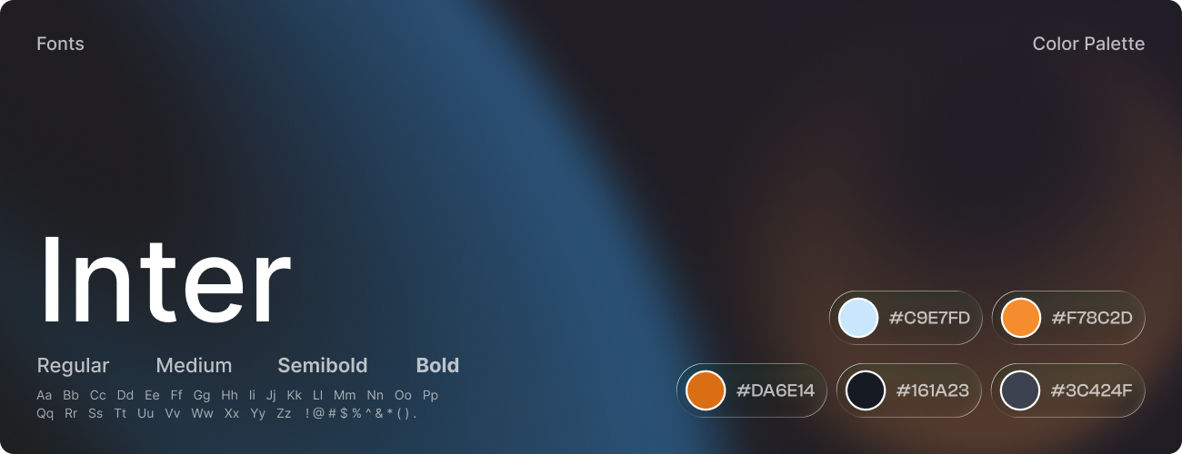
Style
The visual identity of BastionGPT was crafted to embody trust, clarity, and professionalism, aligning with the precision and empathy expected in the healthcare domain. Every design element was intentionally chosen to create a calm, reliable, and user-focused experience for medical professionals.
The color palette featured soft blues and whites to convey cleanliness and confidence, supported by light grays for structure and readability. Subtle orange accents were used strategically to highlight key actions and guide user attention without visual strain. The typography system utilized the Inter typeface for its modern clarity and cross-device accessibility - bold weights emphasized hierarchy, while regular weights maintained smooth readability across data - heavy screens.
Software