Patients is a modern health - focused mobile application designed to simplify the doctor and patient journey through seamless digital interaction. The app enables users to manage consultations, track medical updates, and stay connected with physicians anytime, offering a smooth, accessible, and intuitive healthcare experience.
Created as a patient centric solution, delivers a clean UI, quick navigation, and essential features such as onboarding screens, secure login, and instant consultation access. With a focus on usability and clarity, the app aims to enhance healthcare accessibility and ensure users receive timely support right from their pocket.
Patients often struggle with time - consuming hospital visits, unclear medical updates, and the lack of an easy communication channel with their doctors. This gap creates delays in consultation and reduces the efficiency of healthcare support.
The Patients app introduces a digital bridge between doctors and patients by offering instant access to appointments, prescriptions, and secure communication. With a streamlined flow, modern UI, and simple onboarding, the app makes healthcare more connected, efficient, and convenient for everyday users.
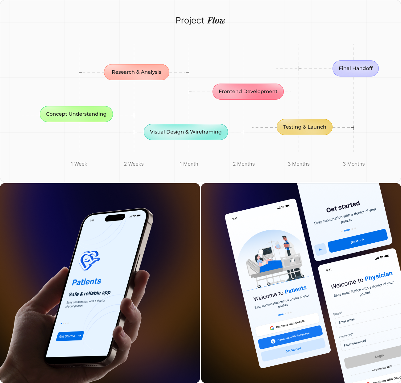
The interface helped map the complete journey of how patients interact with the app from their first onboarding screen to booking a consultation. By identifying each touchpoint, we clarified user expectations, reduced friction, and created a smoother end-to-end flow.
This process connected user actions, backend processes, and UI behaviors, ensuring the app delivers a consistent, predictable, and reassuring healthcare experience. It allowed us to refine key moments, simplify navigation, and design interactions that feel natural, fast, and patient friendly.
The research analyzed core in app flows such as account onboarding, secure login, consultation access, and ongoing interaction with medical information.
Findings emphasized the need for a streamlined platform structure, intuitive navigation, and minimal interaction steps to support quick and stress free use. These insights informed platform level decisions around feature prioritization, screen hierarchy, and interaction consistency, ensuring the application delivers a reliable, accessible, and user-friendly healthcare experience.
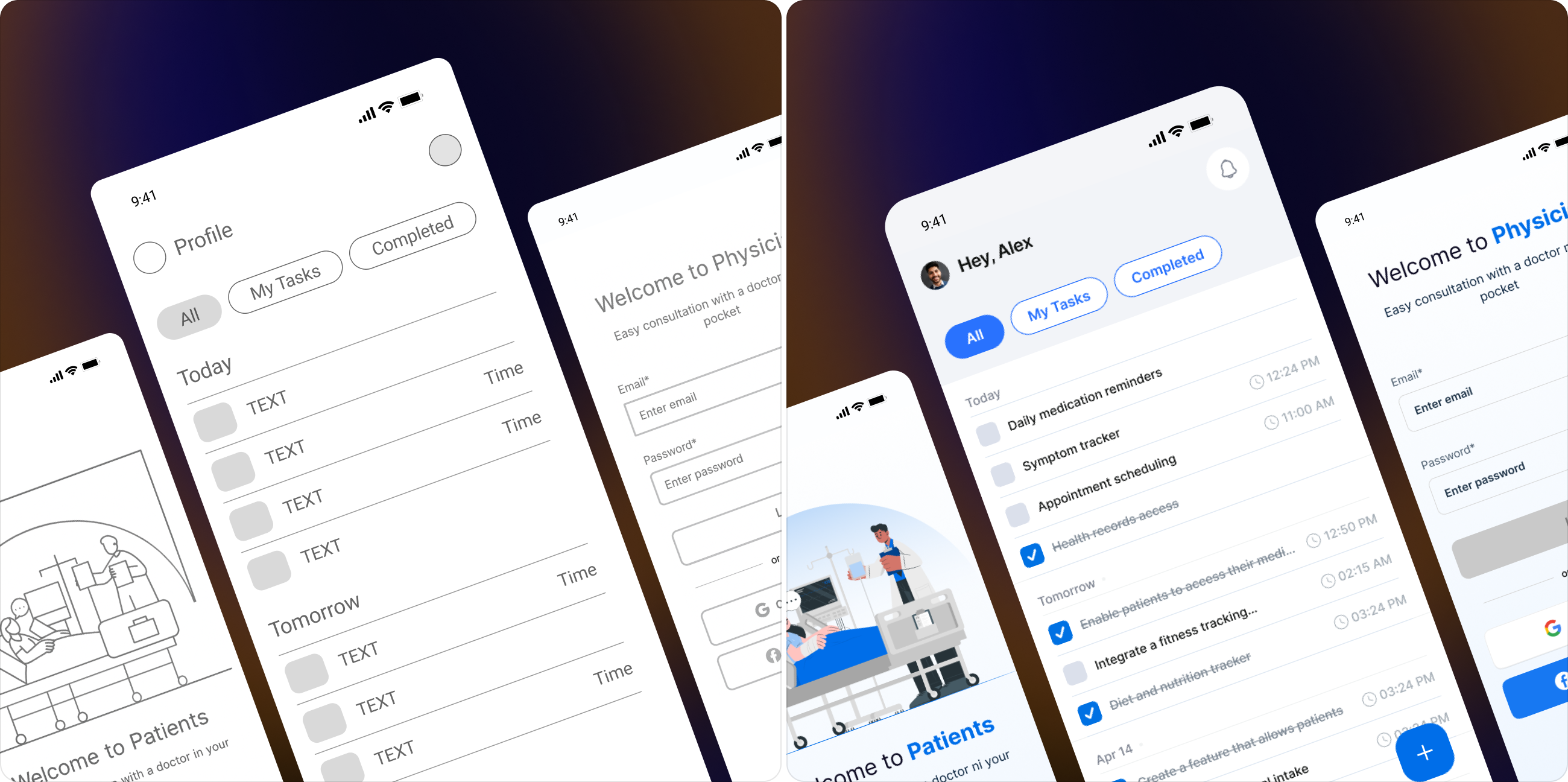
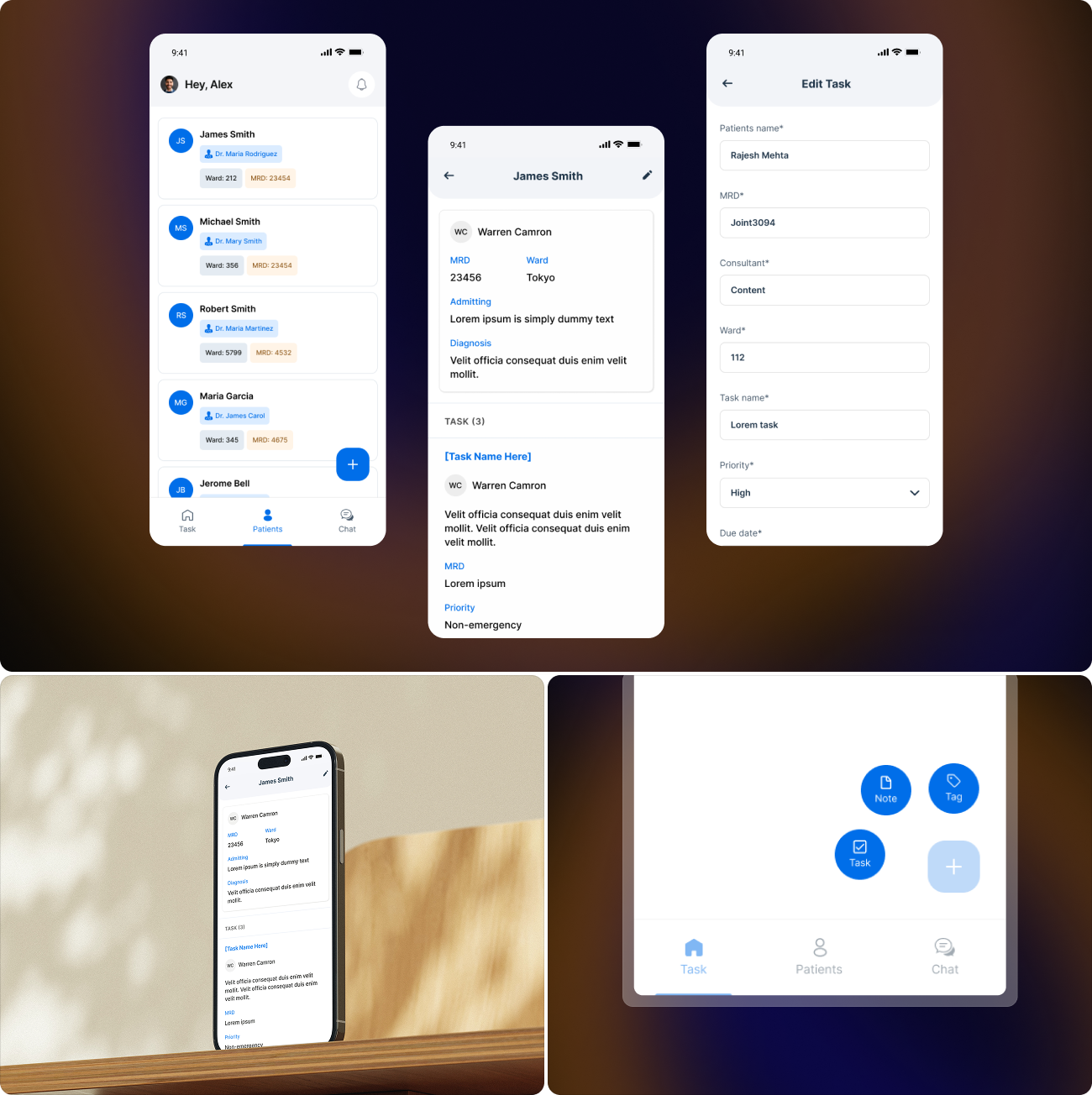
The Patients app UI focuses on clarity, simplicity, and comfort for users seeking quick medical support. Every screen is built with clean spacing, soft visuals, and intuitive interactions, allowing patients to navigate effortlessly through onboarding, login, and consultation access without confusion.
A minimal layout, bold headings, and easily accessible action buttons guide users through the experience with confidence. The interface ensures fast task completion from signing in to managing health updates creating a friendly and reliable environment that makes healthcare feel approachable and always within reach.
The Patients app follows a clean and minimal visual identity built around the Helvetica for clear readability. Its typography delivers a modern, dependable, and easy-to-scan experience ideal for healthcare tasks where clarity matters most. Letter spacing, rounded edges, and generous spacing ensure a calm, accessible interface.
The color palette blends a strong, vibrant blue with a soft, neutral white, creating a balance between trust and simplicity. This combination supports high contrast, intuitive navigation, and a visually soothing atmosphere.