Get in touch
Work location
B-810/811, World Trade Tower (WTT), Makarba, Sarkhej Gandhinagar Highway, Ahmedabad,
Gujarat, India, 380015
Social link
Magic Finance is a mobile-first fintech platform built specifically for internal operational teams to manage and track credit card applications end to end.
The platform enables team members to create applications, monitor their progress, log calls, schedule follow ups, and track bank decisions from a single unified interface, eliminating the need for multiple disconnected tools.
The credit card application workflow was previously managed through a combination of phone calls, spreadsheets, and informal communication channels. This fragmented approach made it difficult for internal teams to maintain visibility over application status, follow-up history, and bank responses, leading to delays, missed actions, and operational inefficiencies.
The platform was designed as a single internal system where the entire credit card application lifecycle can be managed. Team members can create and track applications, log call outcomes, schedule and manage follow ups, update document status, and monitor bank approvals or rejections within the same interface.
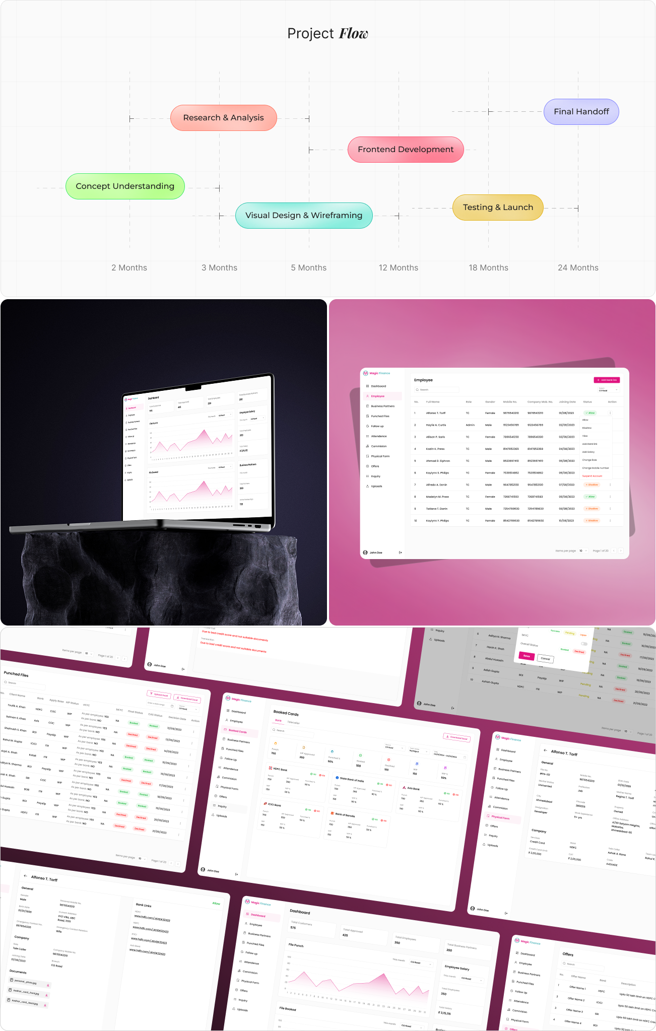
The design process began with mapping the internal workflow followed by team members, from lead entry to final bank decision. Each step was analyzed to identify friction points, repetitive actions, and opportunities to simplify task execution.
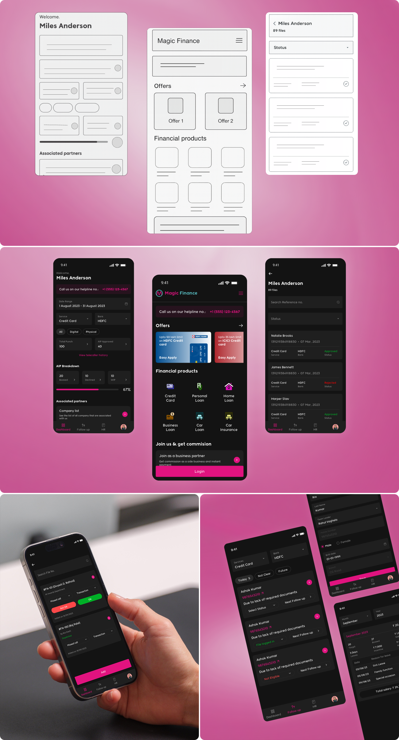
Early wireframes focused on optimizing speed and clarity, ensuring that critical information such as application status, follow up dates, and call outcomes were visible at a glance. These wireframes evolved into high fidelity interfaces through iterative design, balancing data density with usability.
User research focused on understanding how internal teams manage high volumes of applications on a daily basis. The need for quick status recognition, minimal interaction depth, and fast access to actions emerged as key priorities.
Insights revealed that users preferred to manage all follow ups and call tracking directly within the platform rather than relying on external notes or reminders. This influenced the integration of status, next action indicators, and historical logs into core application views.
The user interface architecture was designed around task-based workflows rather than feature-based navigation. Screens are organized to support core activities such as reviewing applications, logging calls, scheduling follow ups, and updating application status with minimal navigation effort.
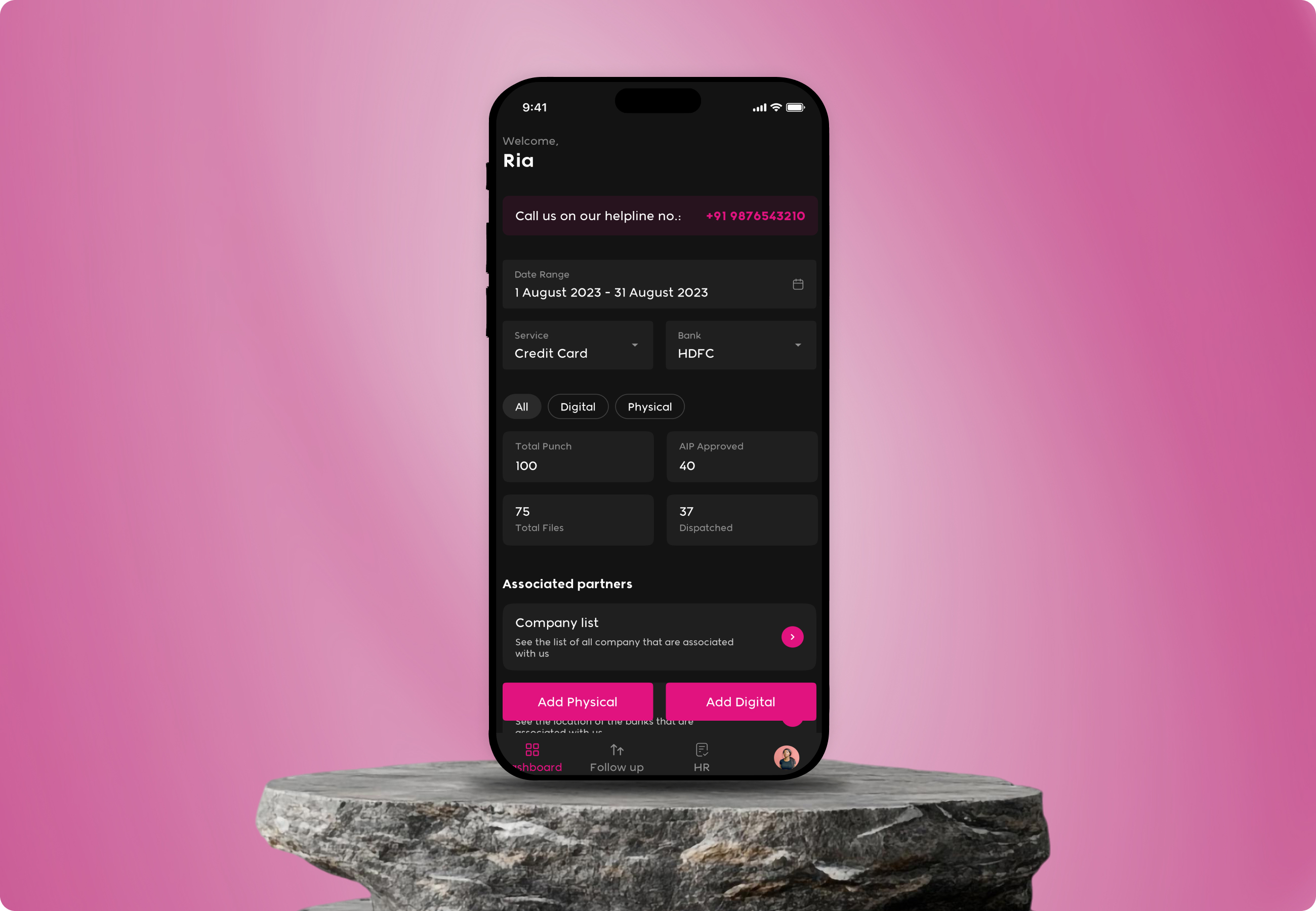
The dashboard functions as the central workspace, providing an overview of application counts, statuses, and pending follow ups. List based layouts and reusable card components allow users to quickly scan, filter, and act on applications from a single view.
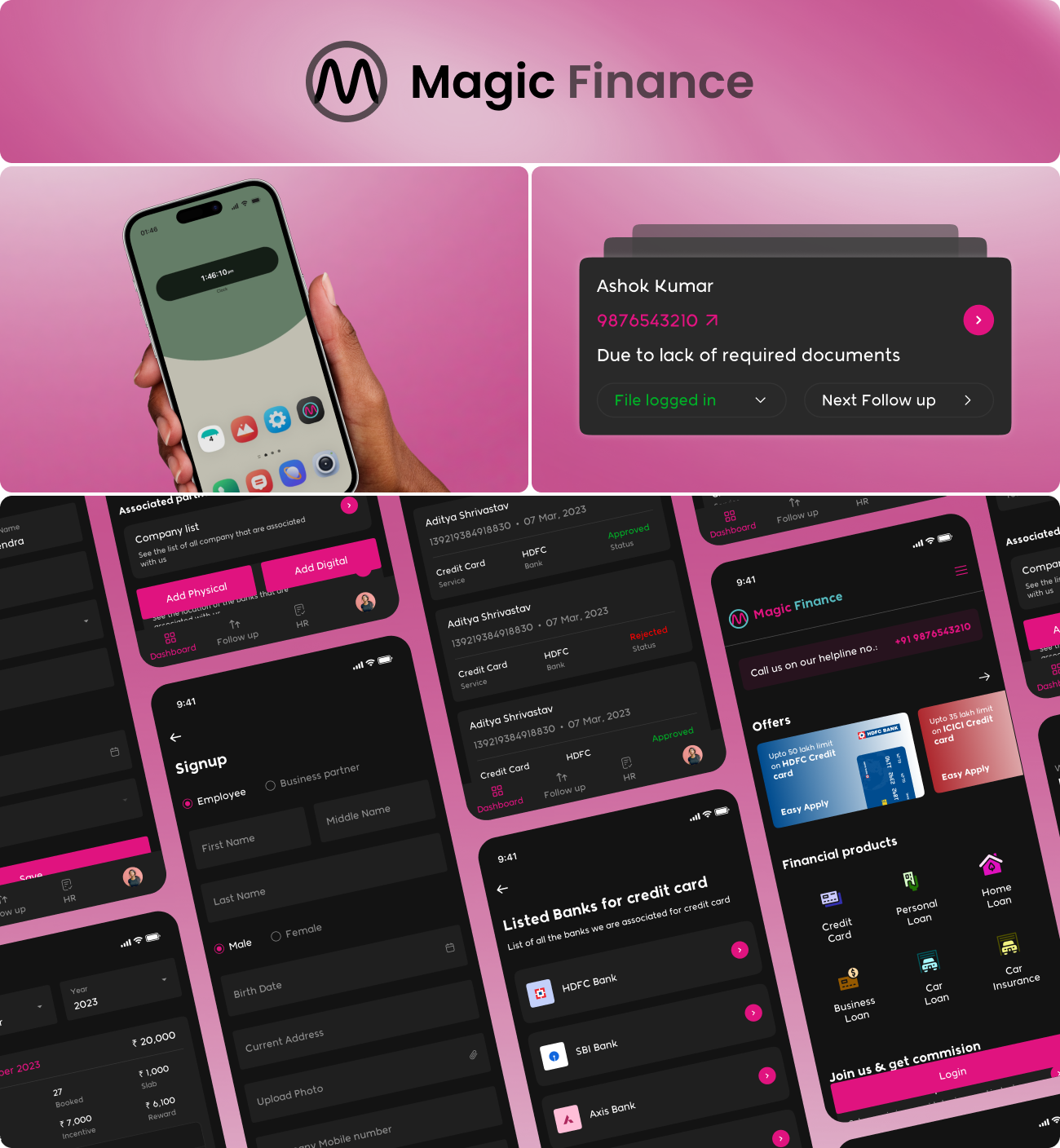
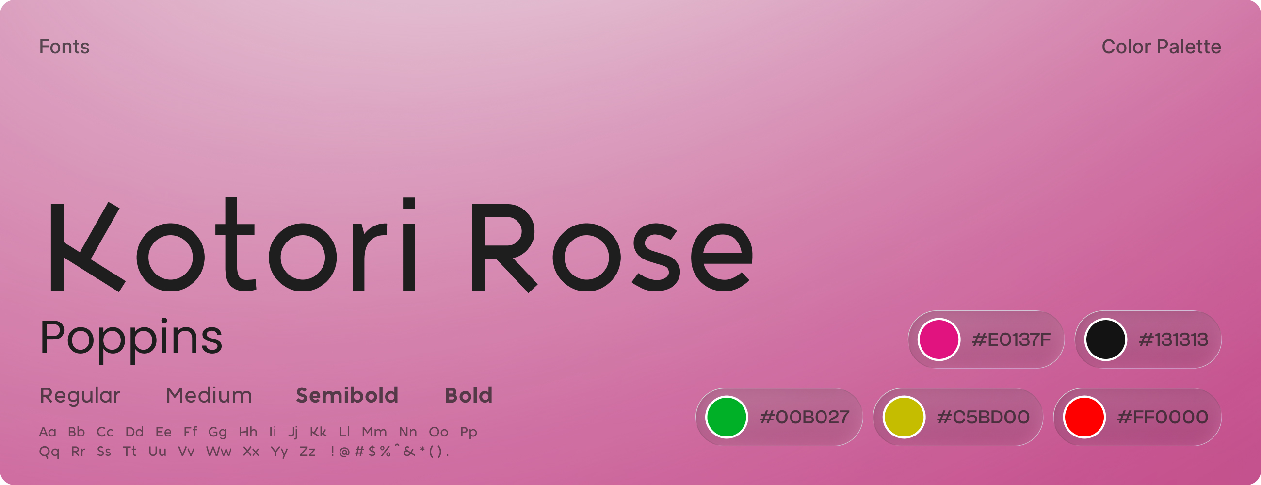
The visual design adopts a dark themed interface to support extended usage and reduce eye strain for internal users. High contrast elements ensure readability across information heavy screens while maintaining a modern and professional fintech aesthetic.